Data Visualizing using R and `ggplot2`

This project presents data visualizations using R to explore the resident rat population of New York City, and the effect of Hurricane Sandy on rat sightings. The NYC rat sighting data is made publicly available
More information on this assignment can be found on Dr. Andrew Heiss' Data Visualization project page.
Set Up
To begin, I set up my R Markdown file, loaded all the libraries I will be using, and uploaded the rat sightings data. This rat sighting data is made publicly available. This data is every rat sighting reported to the NYC Health Department from 2010-2017.
Data Wrangling
In the following steps, I cleaned the original data set and created a smaller data frame, rats_count. This will be the data frame I will use in my visualizations.
# Here I wanted to make the column titles more syntactically appropriate
# for R. I also found that there was one entry of "Unspecified" that needed to be
# removed to make for more clean and accurately visualizations.
rats_clean <- rats_raw %>%
  rename(created_date = `Created Date`,
         location_type = `Location Type`,
         borough = `Borough`) %>%
  mutate(created_date = mdy_hms(created_date)) %>%
  mutate(sighting_year = year(created_date),
         sighting_month = month(created_date),
         sighting_day = day(created_date),
         sighting_weekday = wday(created_date, label = TRUE, abbr = FALSE)) %>%
  filter(borough != "Unspecified")

rats_clean <- rats_clean %>%
  transform(rats_clean, month = month.abb[sighting_month]) %>%
  mutate(highlight = month %in% c("Jun","Jul","Aug"))

# Here, I make my final, clean data frame from which I will be using in my
# visualizations
rats_count <- rats_clean %>%
  count(borough, sighting_weekday,
        month, sighting_year, highlight) %>%
  rename(num_rats = n)

rats_year_count <- rats_count %>%
  group_by(sighting_year) %>%
  summarise(total = sum(num_rats))
Data Exploration
What story are you telling with your new graphic?
To begin, I wanted to do a quick visualization of the entire data set to see what initial trends I notice. I chose to use a lollipop chart for this first accounting because it allows the audience to more quickly ascertain total numbers. We can see from this initial visualization that from 2013-2016, rat sightings increased each year, with a drop off in 2017.
The summer months of May, June, July, and August had significantly more sighting than any other season of the year, with July as the month with the highest number of recorded rat sightings than any other month. Here, I elected to highlight those months to draw attention to their significance.
Though I am not an expert on preferred living conditions of our rodent friends, the data suggests that perhaps the hot summer months are more agreeable with their public lifestyles. With the summer comes tourists, and with tourists comes increased food scraps and trash - all the goodies that rats enjoy. While I do not like the heat and would seek shelter from the heat and people in the cool, dank tunnels of the city, rats it would seem prefer the scorching streets of the concrete jungle.
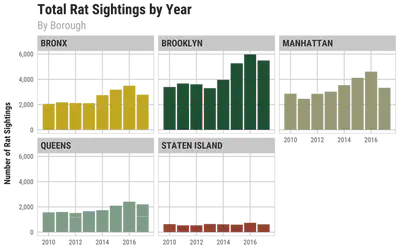
I chose to explore the frequency of rat sightings each year by borough and it is clear that many of our friendly NYC rats are hipsters living in Brooklyn. The number of rat sightings in Brooklyn surpass those of the Bronx, Manhattan, Queens, and Staten Island. In fact, Staten Island is a veritable rat ghost town when compared to the other boroughs. Perhaps the large amount of green space on Staten Island allows for the rats to keep more to themselves than in the other boroughs that have less green space.
Lastly, I again showed the number of rat sighting by month and by borough. With this level of detail, we can see that the Bronx experiences less variation across the months of the year whereas Queens and Brooklyn sees defined spikes during the summer months.
How did you apply the principles of CRAP (Contrast, Repetition, Alignment, Proximity?
When creating these initial four graphs, I wanted to ensure I was applying the principles of CRAP - contrast, repetition, alignment, and proximity. I utilized consistent color palettes within the graphs for contrast and repetition and I used the same font family throughout the graphs as well. For alignment, I kept titles and subtitles left-aligned.
Additionally, I applied Kieran Healy’s principles of great visualizations by using color to distinguish the three months that saw the greatest number of rat sightings, June, July, and August. I also used color to highlight the different boroughs when comparing rat sightings.
Lastly - but perhaps most importantly - I created visualizations that are truthful, functional, beautiful, insightful, and enlightening. For example, I elected to use a lollipop chart to visually encode data in a way that more easily conveys total number than fat columns may.
# Total rat sightings by year
ggplot(rats_year_count) +
  aes(x = sighting_year, y = total) +
  geom_pointrange(aes(ymin = 0, ymax = total),
                  fatten = 5, size = 1.5,
                  color = "#8DA5B5") +
  scale_y_continuous(labels = comma) +
  theme_minimal(base_family = "Roboto Condensed", base_size = 12) +
  labs(title = "Total Rat Sightings by Year",
       subtitle = "in the Boroughs of New York City",
       x = NULL,
       y = "Number of Rat Sightings") +
  theme(panel.grid.minor = element_blank(),
        plot.title = element_text(face = "bold", size = rel(1.7)),
        axis.title.y = element_text(margin = margin(r = 10)))


# Total rat sightings by month
ggplot(rats_count) +
  aes(x = month, y = num_rats, fill = highlight) +
  geom_col() +
  scale_x_discrete(limits = c("Jan","Feb","Mar","Apr","Jun",
                              "Jul","Aug","Sep","Oct","Nov","Dec")) +
  scale_y_continuous(labels = comma) +
  scale_fill_manual(values = c("#5086A7","#BDDEF2")) +
  guides(fill = FALSE) +
  theme_minimal(base_family = "Roboto Condensed", base_size = 12) +
  labs(title = "Total Rat Sightings by Month",
       subtitle = "in the Boroughs of New York City",
       x = NULL,
       y = "Number of Rat Sightings") +
  theme(panel.grid.minor = element_blank(),
        plot.title = element_text(face = "bold", size = rel(1.7)),
        axis.title.y = element_text(margin = margin(r = 10)))


# Rat sightings per year, by borough
ggplot(rats_count) +
  aes(x = sighting_year, y = num_rats, fill = borough) +
  geom_col() +
  scale_y_continuous(labels = comma) +
  scale_fill_manual(values = wes_palette(n = 5, name = "Cavalcanti1")) +
  facet_wrap(vars(borough)) +
  guides(fill = FALSE) +
  theme_minimal(base_family = "Roboto Condensed", base_size = 12) +
  labs(title = "Total Rat Sightings by Year",
       subtitle = "By Borough",
       x = NULL,
       y = "Number of Rat Sightings") +
  theme(panel.grid.minor = element_blank(),
        plot.title = element_text(face = "bold", size = rel(1.7)),
        plot.subtitle = element_text(face = "plain", size = rel(1.3), color = "grey70"),
        strip.text = element_text(face = "bold", size = rel(1.1), hjust = 0),
        axis.title = element_text(face = "bold"),
        axis.title.y = element_text(margin = margin(r = 10)),
        strip.background = element_rect(fill = "grey90", color = NA),
        panel.border = element_rect(color = "grey90", fill = NA))


# Rat sightings per month, by borough
ggplot(rats_count) +
  aes(x = month, y = num_rats, fill = borough) +
  geom_col() +
  scale_x_discrete(limits = c("Jan","Feb","Mar","Apr","Jun",
                              "Jul","Aug","Sep","Oct","Nov","Dec")) +
  scale_y_continuous(labels = comma) +
  scale_fill_manual(values = wes_palette(n = 5, name = "Cavalcanti1")) +
  facet_wrap(vars(borough)) +
  guides(fill = FALSE) +
  theme_minimal(base_family = "Roboto Condensed", base_size = 12) +
  labs(title = "Total Rat Sightings by Month",
       subtitle = "By Borough",
       x = NULL,
       y = "Number of Rat Sightings") +
  theme(panel.grid.minor = element_blank(),
        plot.title = element_text(face = "bold", size = rel(1.7)),
        plot.subtitle = element_text(face = "plain", size = rel(1.3), color = "grey70"),
        strip.text = element_text(face = "bold", size = rel(1.1), hjust = 0),
        axis.title = element_text(face = "bold"),
        axis.title.y = element_text(margin = margin(r = 10)),
        strip.background = element_rect(fill = "grey90", color = NA),
        panel.border = element_rect(color = "grey90", fill = NA))
The Effect of Hurricane Sandy on Rat Sightings
Hurricane Sandy hit New York City on October 29, 2012, and suffered its effects for several days later. How did Sandy affect our rat friends of NYC? Were they able to seek shelter from the storm, or did the storm disrupt their lives as it did the rats' human neighbors?
Thus, I wanted to investigate if Hurricane Sandy had any effect on the number of rat sightings. I imagine two scenarios: 1) where rats stayed hidden, out of harms way, and thus the number of sightings either stayed the same or went down; or, 2) the flooding caused by the storm destroyed their nests and thus forced them out onto the streets.
Sandy hit NYC on Monday, October 29, 2012, so I elect to use a slope graph to show the change in rat sightings from Sunday - the day before the storm - to Thursday - three days after the storm. I decided to start with Sunday as it represents any other day, and I chose to go through Thursday since we know from news reports that Sandy really lingered in the city, causing damage over the days after it hit.
As soon as I plotted the data, the story was clear.
All boroughs except for Staten Island saw an increase in rat sightings from Sunday to Thursday - and amazingly, Brooklyn and Queens saw significant increases in rat sightings - Brooklyn nearly tripled its rat sightings from Sunday to Thursday!
As I did in my visualizations above, I used Kieran Healy’s principles of great visualizations by using color to distinguish the boroughs and channeled Alberto Cairo when deciding to use a slope graph to encode the Hurricane Sandy data. Furthermore, this slope graph is an example of a visualization that is truthful, functional, beautiful, insightful, and enlightening.
# Create the Sandy rats data set
sandy_rats <- rats_count %>%
  filter(sighting_year == 2012) %>%
  filter(month == "Oct") %>%
  filter(sighting_weekday %in% c("Sunday", "Thursday")) %>%
  mutate(sighting_weekday = factor(sighting_weekday))


ggplot(sandy_rats, aes(x = sighting_weekday,
                       y = num_rats, group = borough, color = borough)) +
  geom_line() +
  geom_point(aes(color = borough), size = 4) +
  scale_color_manual(values = wes_palette(n = 5, name = "Cavalcanti1")) +
  scale_y_continuous(breaks = scales::pretty_breaks(n = 20)) +
  theme_minimal(base_family = "Roboto Condensed", base_size = 12) +
  labs(title = "Increase in Rat Sightings",
       subtitle = "During Hurricane Sandy",
       x = NULL,
       y = "Number of Rat Sightings") +
  theme(panel.grid.minor = element_blank(),
        plot.title = element_text(face = "bold", size = rel(1.7)),
        axis.title.y = element_text(margin = margin(r = 10)))